On view November 19, 2021 – February 27, 2022; Curated by Maurine St. Gaudens Studios
Description
Underwritten by Yvonne Boseker with support from John and Barbara Hazeltine, Harris Fine Art, and an anonymous donor
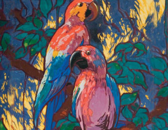
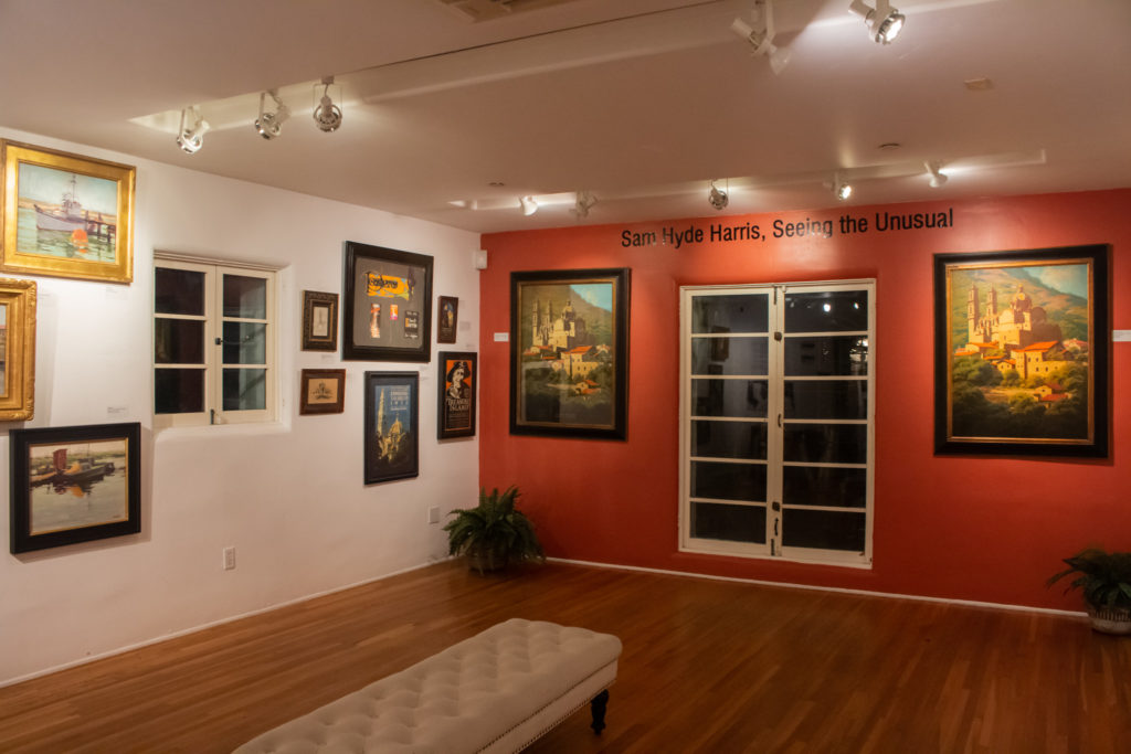
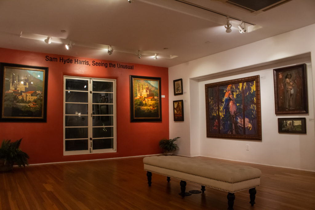
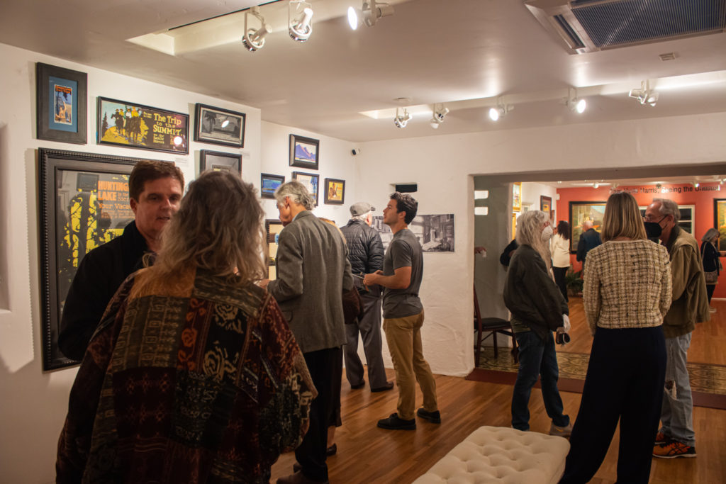
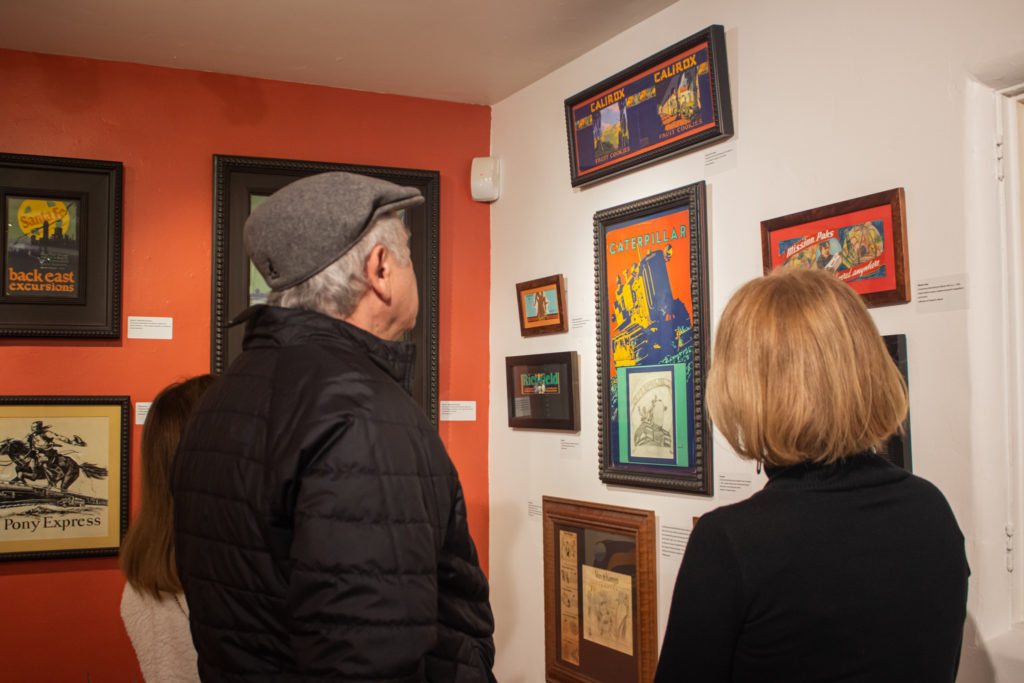
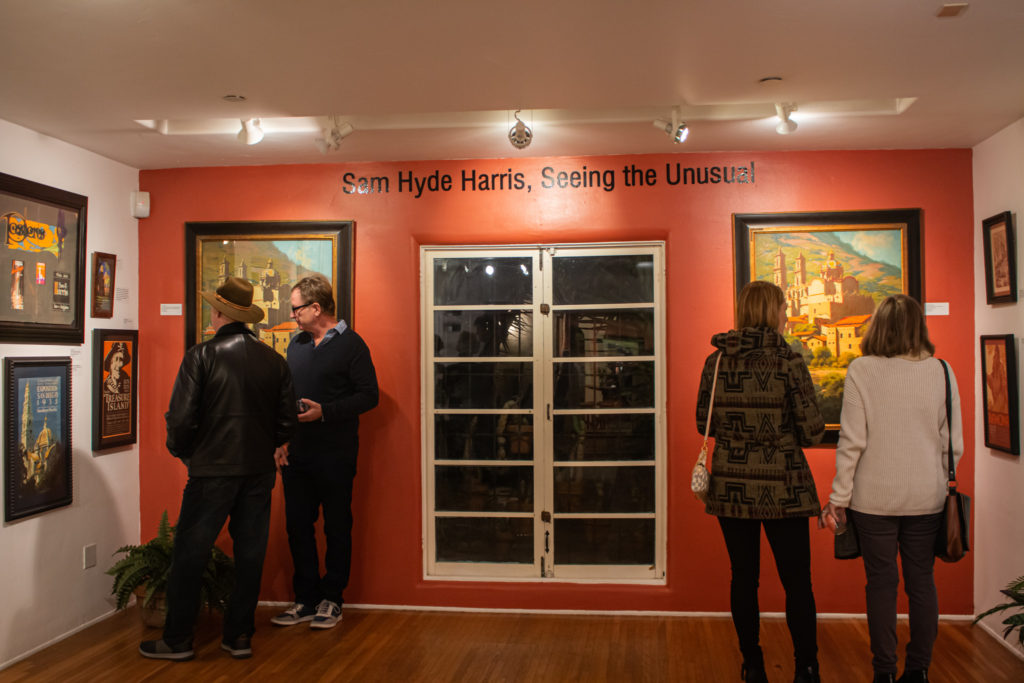
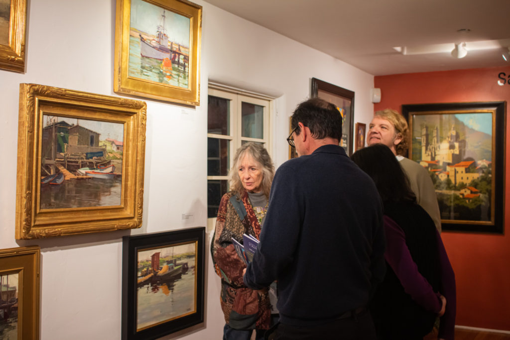
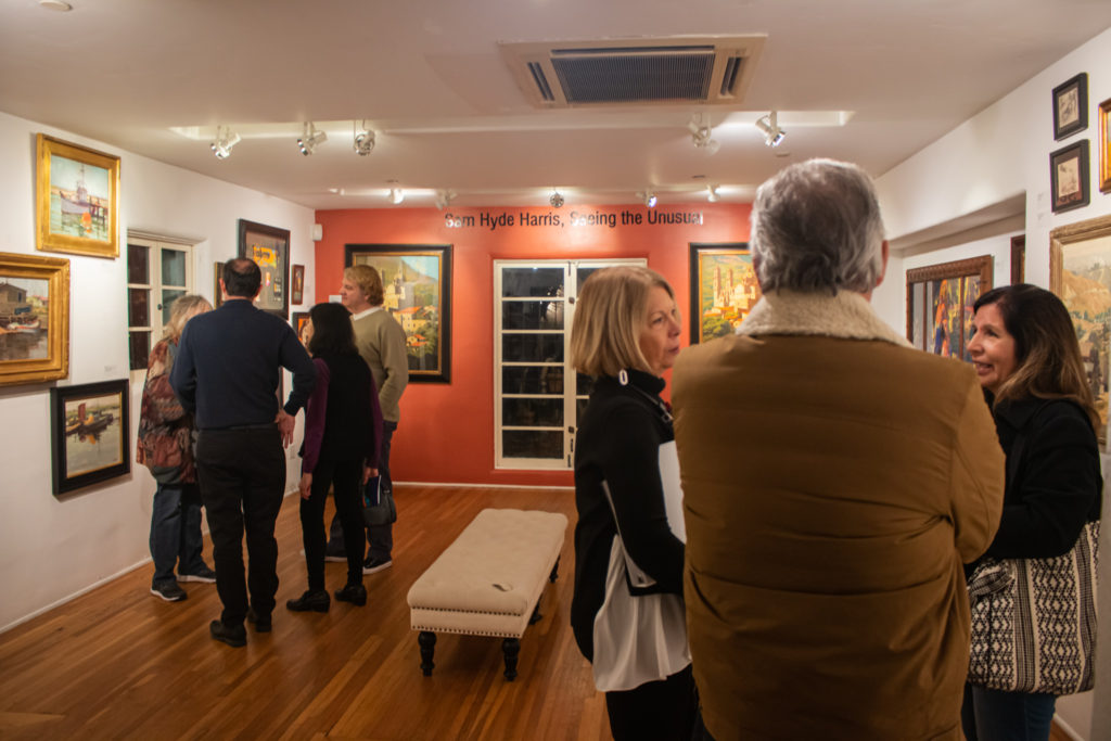
Casa Romantica presents a rare and comprehensive look at the career of Sam Hyde Harris, a noted twentieth-century California artist. Winning over 100 awards during his career as a fine art painter and commercial artist, this exhibit showcases his bold, exciting and relatively unknown commercial advertising work through his fine art paintings that captured the scenic beauty of California.
Artist Bio
In discussing the award-winning early California artist, Sam Hyde Harris (1889-1977) and his decade’s long career, art critics and historians have basically concentrated on his fine art, or what is known as his en plein air painting. However, rarely do any of these discussions of his oeuvre consider the breadth of his commercial work, particularly his storied career creating iconic images for the railroad industry. Harris was in fact a multi-talented artist who was able to work at both his chosen professions; commercial and fine art, for over seventy years.
Harris’ career, although closely related to California and the American West, began in his native England. It was in London, prior to moving to California with his family in 1903, that Harris as a youth, found employment in the Artists Department of André & Sleigh, Ltd., Photo-Engravers, Bushey, Herts, London (England). And as he said of himself, “I have made a living with pen, pencil, and brush since the age of fourteen.” Once in California he gained employment in 1906 with Charles R. Mogel and Aaron E. Kilpatrick as a painter of everything from signs, designing billboards to hand-lettering show cards. Among his assignments, he decorated walls of buildings sometimes six stories high with lettering six feet tall. In a short time, due to the quality of his work, which was of such a high standard that it gained recognition from many in the commercial art field – particularly for skills shown in his calligraphy and exquisite lettering, he was able to establish his own commercial art business at 113 West 6th Street in Los Angeles.
From a historical standpoint, the promotional poster is probably one of the oldest forms of advertising. Throughout history, the pictorial symbol was used and understood by those unable to read. Quite possibly in no other field has the poster played such an important role as in the field of travel and transportation. The poster has to speak quickly, deliver its idea or its message in a brilliant forceful fashion, establishing itself in an indelible manner in the mind of the observer.
The opening of the twentieth century saw the development of a growing middle class, an increase in leisure and vacation time and the rise in competition from the automobile, prompting the railroad to increase its network of ticket offices and to accelerate the marketing of its product, with the rallying cry, “Take the train.”
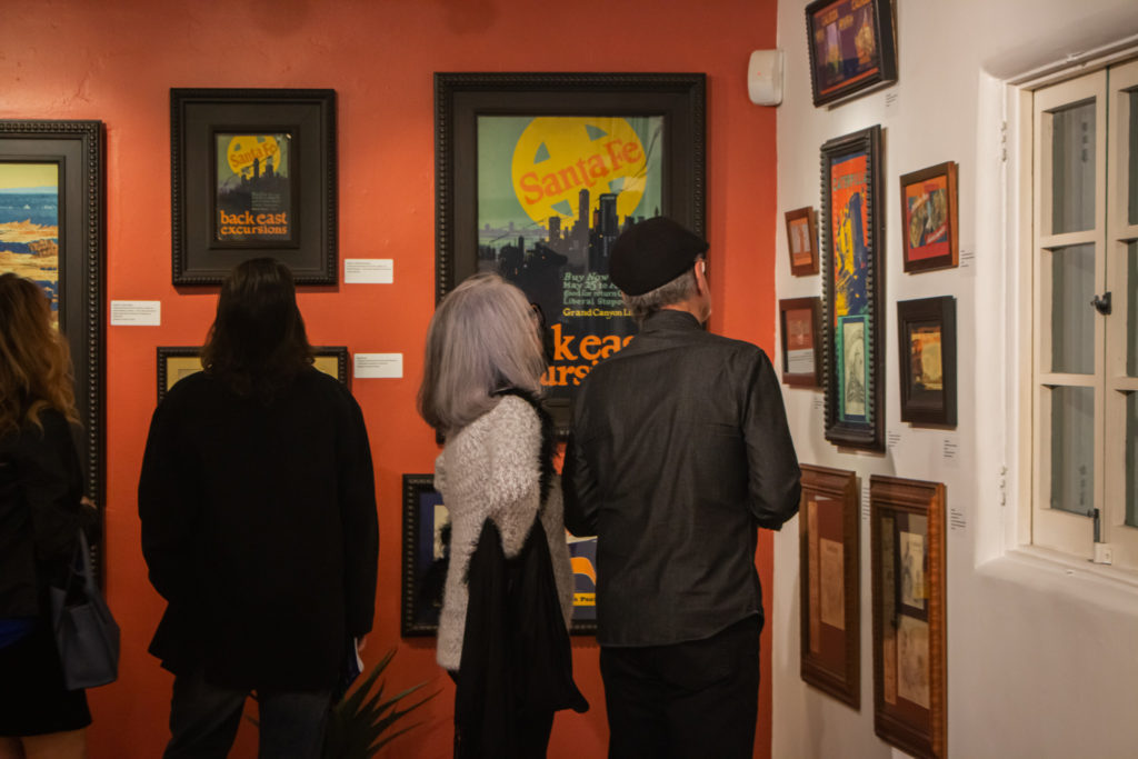
Harris’ commercial career received a tremendous boost when, in 1920, the Atchison, Topeka, and Santa Fe Railway Company, known as the Santa Fe, resumed its poster advertising, following the lifting of government control during WWI, and hired him to work in Los Angeles. The Santa Fe had a colorful history dating back to the 1830s of providing announcements of destinations, schedules, and timetables. By the late 1890s more decorative designs, which were larger and more colorful, were possible due to the use of a large 30 x 40 inch lithography stone which created a standard dimension for the single sheet poster.
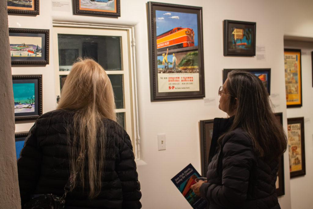
Harris developed a style and design distinctly his own by 1925, which used brilliant red, blue and yellow highlights to dramatize the concepts which Santa Fe reproduced in its advertising booklets, posters, and newspaper ads. While the majority of railroad advertising appeared in brochures, magazines and newspapers, the more local advertising took the form of billboards and hand-painted posters most of which appeared in department stores, banks, window displays, and bulletin boards in ticket offices and lobbies.
As with Santa Fe, Harris had a long involvement with Southern Pacific Railroad. He continued his association with Southern Pacific throughout World War II with some of the most striking posters being those relating to Southern Pacific’s wartime promotional images. One, for example, depicts a young soldier carrying a rifle with a backpack and the wording on the poster states, “Think before you travel. You can speed his visit home by giving up your summer train trips.”
From the 1910s continuing through the 1950s, Harris’ commercial business concerned itself mainly with assignments from the major railroad companies. Harris realized that his commercial work had a great influence on those who viewed it. He understood that pictures spoke to the universal language of positive advertising and promotion regardless of the product. Some of his most iconic designs were created for the railroads; however, Harris’ name is also associated with both regional and national product lines, including: Caterpillar Tractor Company, Gilmore Oil Company, Los Angeles Brewing Co. and Van de Kamp’s Holland Dutch Bakeries.
Harris’ commercial business was located near the office of Van de Kamp’s co-founder Lawrence L. Frank. It was Frank who approached Harris and requested an advertising display for the company’s windows. From this collaboration Harris redesigned the signature style of the company name and created the Dutch Blue Windmill which was conceived and incorporated into the famous trademark of the company. The first Van de Kamp’s store, which opened in 1921, was designed by motion picture art director Harry Oliver (1888-1973) inspired by and based on Harris’ original windmill design.
Not unlike some of his contemporaries such as Maynard Dixon, Maurice Logan, and Hernando Villa, Harris was a creative artist who could master both the disciplines of commercial art and fine art at the same time. He started exhibiting his paintings of early California by 1918 and continued to exhibit and win awards until the late 1960s. He loved to teach and spent many fruitful years instructing other artist on the fundamentals of proportion, depth and color; he taught them to learn to see.
From his early beginnings in England throughout the better part of the century, Harris’ designs shaped the consciousness of early to mid-twentieth century consumers and travelers. Sam Hyde Harris, Seeing the Unusual reveals the importance of revisiting the historical aspect of consumerism which is found in Harris’ work now being viewed within the context of his lengthy and highly creative career.
Written by Maurine St. Gaudens and Joseph Morsman
Gallery
 Sam Hyde Harris, Seeing the Unusual
 Sam Hyde Harris, Seeing the Unusual
 Sam Hyde Harris, Seeing the Unusual
 Sam Hyde Harris, Seeing the Unusual
 Sam Hyde Harris, Seeing the Unusual
 Sam Hyde Harris, Seeing the Unusual
 Sam Hyde Harris, Seeing the Unusual
 Sam Hyde Harris, Seeing the Unusual
 Sam Hyde Harris, Seeing the Unusual
 Sam Hyde Harris, Seeing the Unusual
 Sam Hyde Harris, Seeing the Unusual

 Blog
Blog  Exhibitions
  Past Exhibitions
  Sam Hyde Harris, Seeing the Unusual
 Blog
Blog
 Sam Hyde Harris, Seeing the Unusual

